

.avif)
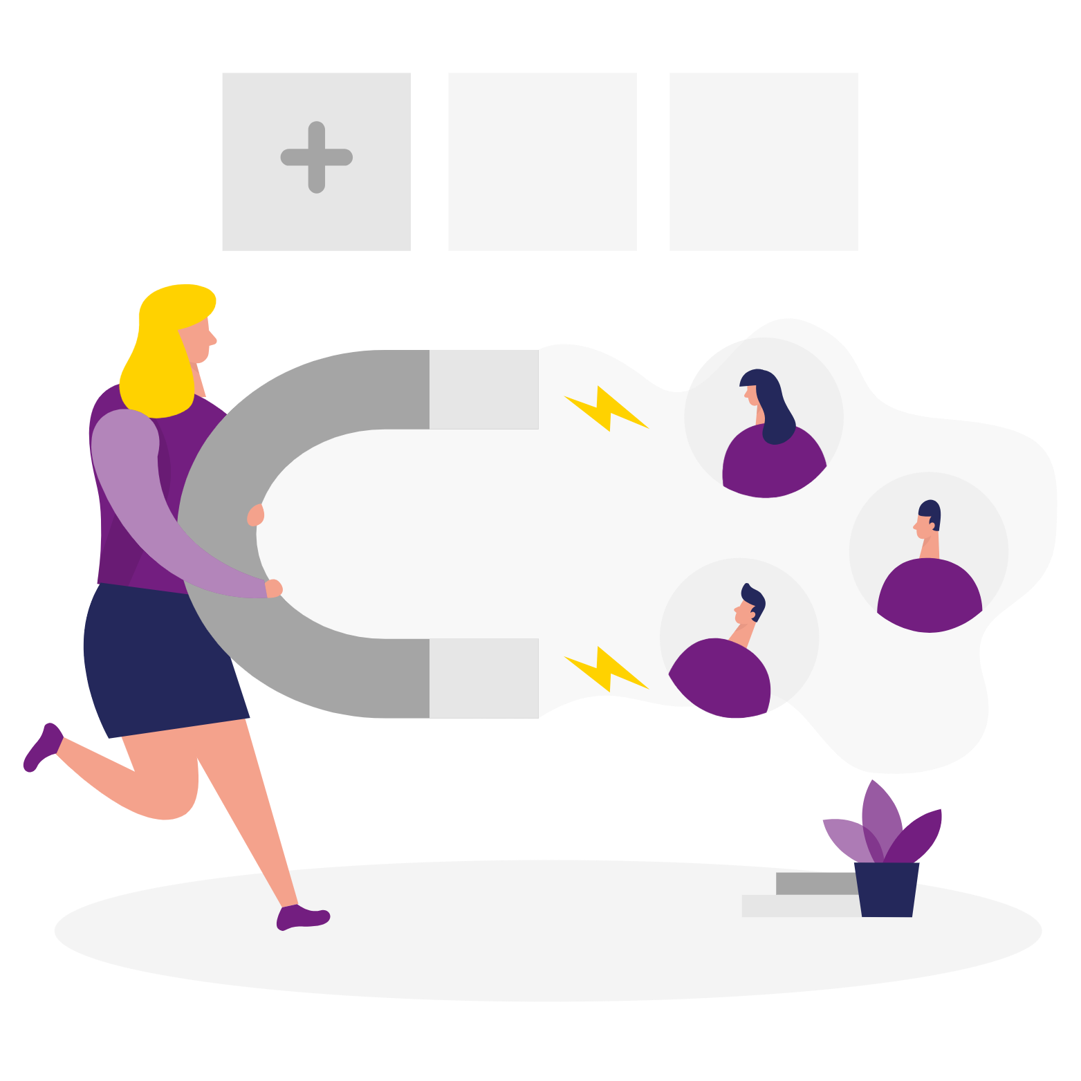
Another summer of sailing at a loss. Clients were coming back to the agencies. Many believed in May and June that the tourist activity would resume. Finally, the resumption of the epidemic, especially in Europe, and the implementation of the health pass in France complicate the situation. It is true that Ireland and Canada are opening or will open to vaccinated travelers. However, the continued closure of the United States to vaccinated travelers is dampening hopes for a good autumn. What if you took advantage of this new uncertain period to create or give a new face to your website and gain visibility?
In some previous articles, "Incoming & Travel Agencies: 8 tools to convert your files in 2020!" , we had mentioned the need to digitalize your business while taking advantage of government.
Whether you choose to call upon a freelance, an agency or to launch yourself in the creation or the redesign of your website, keep in mind the following 5 recommendations.
1/ Simplify your navigation menu
When visitors arrive at your website, make sure that your navigation menu is simple, understandable and easily navigable.
Simple in the sense that it is important to limit the number of choices to 6 or 7 pages maximum. These pages allow your customers and visitors to find the essential of what they are looking for without getting lost in the labyrinth of Minotaure. There is the breadcrumb trail, sure, but "less is more" 😊.
Depending on your specialties, you can propose entries by destination, by theme (seminars, company parties, team building, wellness, honeymoons for example). It can also be by activity (trail, cycling, snowshoeing, scuba diving, canoeing, etc). You can imagine pages by season or by month of departure. Save room to talk about your brand, your values and your expertise. Depending on the depth of your offer, create a search bar.
On the other hand, put pages like "Project Managers", "Cgv", "Access", "Our Clients", "Press Review" or "Practical Info" elsewhere.
Have you determined the number of pages? Have you selected your themes?
Then name them using a vocabulary that most people can understand. The pages entitled "About us", "Services", "Our offers", "Blog" and "Contact" are found elsewhere than in the tourism world. They may not seem very original. However, they have the merit of speaking to customers. They say, "I'm in the right place". The search engines also thank you by giving details on the nature of your activity.
If you are not sure what to call a page, why not ask your family and friends or a panel of your most loyal customers? Some of them will understand, for example, what is behind "confirmed departures" or "last minutes" rather than the term "Agenda".
Navigating on your website must be easy and intuitive. We advise you to position your navigation menu horizontally or vertically on the left, but avoid making the drop-down menu too long. Help your visitors to find their way around your site by giving for example a specific color to the page they are on.
2/ The footer: an opportunity to seize
The footer of websites is more and more consulted. Approximately 1 out of 4 Internet users scrolls to the bottom.
Of course, this is where you'll find legal information, cookie management and other terms and conditions of sale. Create a section in the footer, if applicable, called "we're talking about us" or dedicated to the press, insert the site map or your FAQ.
Remind them of the payment methods accepted, the presence of your social networks, the labels or other networks to which you belong. Indicate the opening hours of your agency, the access conditions and other practical information. Encourage your visitors to subscribe to your newsletter, to make an appointment or to ask for a quote.
But, take the opportunity to create another type of menu, different from the one in the header, more detailed. Visitors could continue browsing your site by consulting other sections than the ones they came for. For example, you could create a top 10 of your trips sold. If you sell mainly hikes, you could highlight the 10 most beautiful hikes to do in France or in a region you want to highlight. This could be an invitation to personalize a vacation project.
3/ Your site must be mobile-friendly
The fact is that more of us use our smartphone than our computer to connect to the Internet. In October 2020, 2/3 of the time spent by French people surfing the Internet will be spent on a cell phone, i.e. 1 hour 32 minutes each day. In the first quarter of 2021, mobile devices (excluding tablets) generated about 55% of global website traffic.
On the Internet, we work, we relax, we get information, and we buy as for example in France where 3 out of 5 French people who booked in 2020 all or part of their trip did it online.
Therefore, to make your site pleasant to look at, simple to consult and easy to book despite the smaller size of smartphone screens, think about the following elements when redesigning or creating your site:
● Adapt the display to the screen size: your customers should be able to access and read all the information with all the details. Thus, say goodbye to a 12 or 13 px font 🔎 in favor of a 16 px font. This also applies to computers and tablets. If you choose original script fonts, make sure they are easily readable.
● Make clickable areas larger. Indeed, you must take into account the size of fingers, have you noticed for example that Facebook offers different sharing buttons between mobile and computer? Why not take inspiration from it? Accentuate the contrast to improve visibility by putting for example the text in black on a white background. Make the call-to-action button(s) stand out with a bright color different from the background color.
● Good visibility also requires proper use of space. Aerate your content will promote the hierarchy of information, their understanding. You can use different colors or blocks for this.
● Limit the use of the keyboard. Ezus does not teach you anything: that of the smartphone is even smaller than that of a computer. That's why, for example, invite your visitors to log in via Facebook. The geolocation offered by the cell phone makes it possible to avoid entering the city and country. Make it possible to call you with a simple click. If one must use the keyboard, place the title of the input field in the field so that it is clearer and not next to it.
● Take care of the icons Use clear, well-drawn icons so that the user understands their meaning. If possible, double the icons with a text equivalent. The famous hamburger menu symbolized by 3 horizontal lines is not necessarily understood by everyone, especially older customers.
To use: to know if your website is adapted to mobiles, you can use the tool proposed by Google: Mobile Optimization Test.
4/ A blog to serve your reputation and visibility
In your navigation menu, reserve a special place for your blog. You will share with your customers and visitors practical advice on administrative matters (identity card, visa, ESTA form, etc.), health matters (covid, of course, but to travel to certain countries you need to be up-to-date on a number of vaccines).
Also, write articles that will make people want to leave through you. They will show your expertise, your values (for example, trips that promote meetings with local populations). Talk about your last trip to Iceland to admire the recent eruption of the Fagradalsfjall volcano or your last trip on the trails of the Belledonne Massif, the unknown places to visit in Tuscany and list your favorites.
Insert photos and video. However, be careful that this does not affect the loading speed of your site. Images represent on average more than 20% of the weight of a web page. After 3 seconds, 40% of Internet users lose patience and go elsewhere.
Writing for a blog takes time, of course, but in addition to your image as an expert, this tool will bring you to least 2 additional advantages:
- It reinforces the proximity and the interaction with your customers. The exchanges provoked by comments, questions, thanks, and other online videos give a more human, more personal touch to your agency than a competitor offering only a showcase site and/or a blog that is not updated very often.
- You are more visible on the web. Regularly publishing quality articles with words that correspond to the most frequently used searches in search engines (above all Google) frequently leads to an increase in your traffic. If your articles are considered interesting, you will benefit from links pointing to your site. What we call backlinks will participate in the strengthening of your visibility and notoriety. In the medium or long term, you will gain customers.
Who says blog, says need to be present on social networks. It's up to you to choose them according to your objectives and knowing which network(s) your customers and visitors are on. Also, try to see if your customers are willing to use the WhatsApp application.
To use: to measure the loading speed, go for example to GTMetrix.
5/ Think about a newsletter to acquire and retain customers
Do you know how many of us were using email in 2019? 3.9 billion people, or half the world's population. And in France? More than 42 million logged on to an email per month. Globally, the average newsletter open rate in 2020 is about 18%; slightly below in the tourism and leisure sector. However, it is difficult to neglect this channel, as it costs little in terms of money. It is an additional way to acquire and retain your customers.
Once your customer database and your targets are well defined, here are some guidelines for an optimal design of a newsletter:
- The sender: the Internet user must understand who it is. A human touch is a plus, like Groupama's Cerise or Spartoo's Enzo, preferable to a no-reply@domain.com/ or a mailing@domain.com. The address must be the same for each mailing.
- Your object must be clear and punchy. To announce an event such as the reopening of the US to travelers (let's dream a little 😉 ). Avoid words that cause spam (free, win, money, etc).
- Make sure there is a good split between image (1/3) and text (2/3). Holding the reader's attention with a visual will encourage them to read the written content. However, it must remain concise. Don't go for long newsletters at the risk of skipping. Moreover, keep it simple by avoiding the use of several fonts, bold and italics. On the other hand, too many images and you run the risk of getting spammed. Also keep in mind that not all images are displayed in all email accounts.
- Call to action! After browsing your newsletter, your reader should click on buttons that will send them to different travel ideas, different types of contacts (email, phone, social networks, physical address).
- Make sure your brand is present throughout the newsletter: logo in the header and footer, colors of action buttons in line with the graphic charter.
- Don't forget: the legal notice and the unsubscribe link.
- When to send your newsletter and at what rate? First, give priority to the user's opinion by giving him the choice to indicate, if possible during the registration, the frequency at which the newsletters are sent. If not, do some tests to see what corresponds better to your customers' expectations. A newsletter has a short lifespan (about 3 days). Why not start with a Thursday mailing to allow recipients to read the newsletter in a quieter weekend context?
And you, what have you done to make your agency more visible on the Internet?
You are not yet an Ezus customer?
With our software solution, divide by 2 your document generation time and have all your customized documents and travel administration at the same place. Find out how during a demonstration.
📚 Sources :
1. How to restructure your travel agency: https://ezus.io/post/how-to-restructure-your-travel-agency
2. Agences de voyages : 8 outils pour convertir vos dossiers en 2020 : https://ezus.io/article/agences-receptives-de-voyages-8-outils-pour-convertir-vos-dossiers-en-2020
3. Quelles sont les aides financières pour la numérisation de votre entreprise dans votre région ? : https://www.francenum.gouv.fr/comprendre-le-numerique/quelles-sont-les-aides-financieres-pour-la-numerisation-de-votre-entreprise#region10
4. 1 français sur 3 se connecte à internet exclusivement sur smartphone : https://comarketing-news.fr/1-francais-sur-3-se-connecte-a-internet-exclusivement-sur-smartphone/
5. L’Année Internet 2020 en France : https://www.mediametrie.fr/fr/lannee-internet-2020
6. Baromètre Opodo : 60% des Français ont choisi de réserver leur séjour en ligne : https://www.tom.travel/2021/03/18/barometre-opodo-60-francais-reserver-leur-sejour-en-ligne/
7. Baromètre Orchestra/L’Echo : le top 20 des destinations en juillet 2021 : https://www.lechotouristique.com/article/barometre-orchestra-lecho-le-top-20-des-destinations-en-juillet-2021
9. Emailing : le taux d’ouverture moyen en 2020 :https://mondedumail.com/emailing-taux-ouverture-moyen/
10. Mobile Vs Desktop Internet Usage (Latest Data 2021) : https://www.broadbandsearch.net/blog/mobile-desktop-internet-usage-statistics
11. Market Snapshot: Desktop and mobile internet usage in 2020 : https://www.telemediaonline.co.uk/market-snapshot-desktop-and-mobile-internet-usage-in-2020/
12. Percentage of mobile device website traffic worldwide from 1st quarter 2015 to 1st quarter 2021 : https://www.statista.com/statistics/277125/share-of-website-traffic-coming-from-mobile-devices/
13. How Loading Time Affects Your Bottom Line : https://neilpatel.com/blog/loading-time/

Join Ezus today
Request a demo today and discover how our software can help you reach new heights.


.jpeg)

.avif)


.svg)
.jpg)

